How to remove the BOM character from HTML Files?


Byte Order Mark (or BOM) tells the computer how the bytes are ordered in a Unicode document. Because Unicode can be used in 8, 16 and 32 bits –it is important for the computer to understand which encoding has been used. BOM tells exactly the same to the computer.

BOM is actually a “zero-width non-breaking space” (practically a NULL character) and it is represented as U+FEFF
Unicode
Encoding
In ISO-8859-1
BOM appears as
UTF-8 
UTF-16

(big endian)
þÿ
UTF-16

(little endian)
ÿþ
UTF-32

(big endian)
□□þÿ (□ is the ASCII null character)
UTF-32

(little endian)
ÿþ□□ (□ is the ASCII null character)
In HTML code the BOM character can also appear as 

Remove BOM from an XML file

Just open the file in vim text editor use the “nobomb” command
# vim file.xml
:set nobomb
:wq

Removal from HTML Files

Even if you have set the “charset=utf-8″ meta property right -it does not mean that you will not face the BOM problem. If a BOM character is causing problems in your HTML display -the problem actually lies in the text editor and not in your HTML/CSS code.
Most HTML editors, like Dreamweaver, Programmer’s Notepad, TextPad etc., do provide a way to disable BOM. The option usually comes in the place where you set the encoding of your text editor. It may appear in the form of “UTF-8 without BOM” or “UTF-8 No BOM”
Appearance of  character in your HTML code can also be solved using the above encoding change in HTML editor.
Setting UTF without BOM in Macromedia Dreamweaver
Setting UTF without BOM in Programmer's Notepad

Detection and Removal of BOM in UNIX/Linux

Find the list of files containing BOM characters
1

find /var/www/website/ -type f -print -exec hd -n 3 {} \; | grep -1 "ef bb bf" | grep "some_part_of_the_path" > bom_lines.txt

Remove BOM character
1

while read l; do sed -i '1 s/^\xef\xbb\xbf//' $l ; done < bom_lines.txt


Div Centered Vertically and Horizontally


<.div id="horizon">
<.div id="content">


Css :

#horizon {
background-color: transparent;
color: white;
display: block;
height: 1px;
left: 0;
overflow: visible;
position: absolute;
text-align: center;
top: 50%;
visibility: visible;
width: 100%;
}
#content {
background-color: transparent;
font-family: Verdana,Geneva,Arial,sans-serif;
height: 70px;
left: 50%;
margin-left: -125px;
position: absolute;
top: -35px;
visibility: visible;
width: 250px;
}

HTML5 Reset Stylesheet

html, body, div, span, object, iframe,h1, h2, h3, h4, h5, h6, p, blockquote, pre,abbr, address, cite, code,del, dfn, em, img, ins, kbd, q, samp,small, strong, sub, sup, var,b, i,dl, dt, dd, ol, ul, li,fieldset, form, label, legend,table, caption, tbody, tfoot, thead, tr, th, td,article, aside, canvas, details, figcaption, figure, footer, header, hgroup, menu, nav, section, summary,time, mark, audio, video {
margin:0;
padding:0;
border:0;
outline:0;
font-size:100%;
vertical-align:baseline;
background:transparent;
}

body {
line-height:1;
}

article,aside,details,figcaption,figure,
footer,header,hgroup,menu,nav,section {
display:block;
}

nav ul {
list-style:none;
}

blockquote, q {
quotes:none;
}

blockquote:before, blockquote:after,
q:before, q:after {
content:'';
content:none;
}

a {
margin:0;
padding:0;
font-size:100%;
vertical-align:baseline;
background:transparent;
}

/* change colours to suit your needs */
ins {
background-color:#ff9;
color:#000;
text-decoration:none;
}

/* change colours to suit your needs */
mark {
background-color:#ff9;
color:#000;
font-style:italic;
font-weight:bold;
}

del {
text-decoration: line-through;
}

abbr[title], dfn[title] {
border-bottom:1px dotted;
cursor:help;
}

table {
border-collapse:collapse;
border-spacing:0;
}

/* change border colour to suit your needs */
hr {
display:block;
height:1px;
border:0;
border-top:1px solid #cccccc;
margin:1em 0;
padding:0;
}

input, select {
vertical-align:middle;
}

How CSS Positioning Works?

The position property is one of the most useful tools that designers have in their CSS toolbox. However, there are a few concepts about positioning that might baffle beginners. First, what is positioning?

When your browser opens a webpage, it starts rendering elements (divs, paragraphs, headings etc.) in the order they appear in the HTML markup of the page. Positioning is a natural way of organizing how the elements are displayed and an easy resolution to situations like overlaps. There are four types of positioning: static, relative, absolute and fixed.

Elements are statically positioned by default

The default positioning, which is implicitly applied to every element on the page, is static. Static positioning means that every element is positioned in the natural order it is added to the page. Block elements are displayed under other block elements, and inline elements are displayed next to other inline elements.

Relative positioning

Setting the positioning to relative does not by itself produce any noticeable difference in the way the element is displayed on the page. But you can now move it from its normal position with the top, left, bottom and right CSS properties. This comes really handy when dealing with situations in which you need to offset an element, but not anchor it to a specified position on the page.

.relativeDiv{

/*
    Moving the div to the top-left
    from where it would normally show:
 */

position:relative;
top:-50px;
left:-100px;

}

Fixed positioning

Adding position:fixed to the CSS declarations of an element, positions it in relation to the browser window. This allows you to display toolbars, buttons or navigation menus, which are anchored at a fixed position and scroll with the page.

.fixedDiv{

/*
    Fixing the div 20 px from the bottom
    of the browser window:
 */

position:fixed;
right:20px;
bottom:20px;

}

Probably the only drawback is that this positioning is not supported in older browsers like IE6, if you can’t afford the luxury of dropping support for these.

Absolute positioning

An absolutely positioned element is displayed on the page in relation to the document, or a parent element with a positioning different from static. This way, using the top, left, bottom and right CSS properties, you can specify an exact position.

.parentDiv{

/* Absolute and Fixed positioning would work as well: */

position:relative;

}

.absoluteDiv{

/*
    Displaying the div 50px from the right and 90px from
    the top of its parent because of the explicit positioning
 */

position:absolute;
right:50px;
top:90px;

}

The benefits

Using these positioning properties you can achieve all kinds of advanced page layouts, which will bring your designs to the next level. In conjunction with the z-index property, you can change the default overlay rules that apply to elements (elements which appear later in the code are shown above the previous ones).

Multiple Background Images


Applying multiple background images in CSS3 is quite easy, using a comma with the standard background property.


E.g. background: url(image_1.extention) top right no-repeat, url(image_2.extention) bottom right no-repeat;

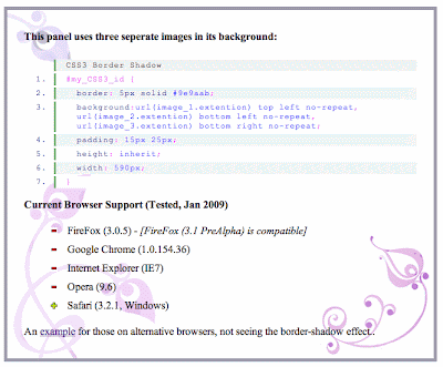
This panel uses three seperate images in its background.

  1. CSS3 Background Image (Multiple)
  2. #my_CSS3_id {
  3. background: url(image_1.extention) top left no-repeat,

    url(image_2.extention) bottom left no-repeat,

    url(image_3.extention) bottom right no-repeat;
  4. }
Example for those on alternative browsers, not seeing the background-image effect..

CSS3 Transition


Use CSS 3 transition to give action to elements in your website, such as change in colour, motion and more!

CSS3 Transition

The basic syntax for creating a css transition is “property”, “duration”, and “type”.

If we take the following example (transition:color 1s ease-in;) – the property we are changing is the color, over a duration of 1 second and using the ease-in method). See below some examples of how this can be implemented into your projects.

CSS3 Colour Transition Example


Mouse over this example paragraph to see it fade to a new colour using a basic CSS3 transition.

  1. CSS3 Transition (color)
  2. .my_class {
  3. transition: color .5s ease-in;
  4. -moz-transition: color .5s ease-in;
  5. -o-transition: color .5s ease-in;
  6. -webkit-transition: color .5s ease-in;
  7. }
  8. .my_class:hover {
  9. color:#066;
  10. }

This is a good technique for creating mouseover actions for links and buttons.


Mouse over this example paragraph to see it rotate 7degrees using a transform transition.

  1. CSS3 Transition (transform)
  2. .my_class {
  3. transition: transform .5s ease-in;
  4. -moz-transition: -moz-transform .5s ease-in;
  5. -o-transition: -o-transform .5s ease-in;
  6. -webkit-transition: -webkit-transform .5s ease-in;
  7. }
  8. .my_class:hover {
  9. transform: rotate(7deg);
  10. -moz-transform: rotate(7deg);
  11. -o-transform: rotate(7deg);
  12. -webkit-transform: rotate(7deg);
  13. }

This can be used to create a more interactive website, such as menu items or image gallery.


CSS3 Box Shadow


CSS Box Shadow

Used in casting shadows off block-level elements (like divs).

.shadow {
  -moz-box-shadow: 5px 5px 5px #ccc;
  -webkit-box-shadow: 5px 5px 5px #ccc;
  box-shadow: 5px 5px 5px #ccc;
}
  1. The horizontal offset of the shadow, positive means the shadow will be on the right of the box, a negative offset will put the shadow on the left of the box.
  2. The vertical offset of the shadow, a negative one means the box-shadow will be above the box, a positive one means the shadow will be below the box.
  3. The blur radius, if set to 0 the shadow will be sharp, the higher the number, the more blurred it will be.
  4. Color

Inner Shadow

Example

Internet Explorer Box Shadow

You need extra elements...

<div class="shadow1">
        <div class="content">
                Box-shadowed element
        </div>
</div>
.shadow1 {
        margin: 40px;
        background-color: rgb(68,68,68); /* Needed for IEs */

        -moz-box-shadow: 5px 5px 5px rgba(68,68,68,0.6);
        -webkit-box-shadow: 5px 5px 5px rgba(68,68,68,0.6);
        box-shadow: 5px 5px 5px rgba(68,68,68,0.6);

        filter: progid:DXImageTransform.Microsoft.Blur(PixelRadius=3,MakeShadow=true,ShadowOpacity=0.30);
        -ms-filter: "progid:DXImageTransform.Microsoft.Blur(PixelRadius=3,MakeShadow=true,ShadowOpacity=0.30)";
        zoom: 1;
}
.shadow1 .content {
        position: relative; /* This protects the inner element from being blurred */
        padding: 100px;
        background-color: #DDD;
}