Material Design for Bootstrap 3 by fezvrasta
Material Design for Bootstrap is a theme for Bootstrap 3 which lets you use the new Google Material Design in your favorite front-end framework.
If you like this project you can support me by donating something on Gratipay, starring this repository, or reporting bugs and ideas.
Read more about Material Design for Bootstrap at the Github page.

bower install bootstrap-material-design
npm install bootstrap-material-design
Getting Started
Download
Install with NPM
You can also install and manage Material Bootstrap using NPM
npm install bootstrap-material-design
Install with Bower
You can also install and manage Material Bootstrap using Bower
bower install bootstrap-material-design
What's included
Material Design for Bootstrap is downloadable in a two forms. First, as less/sass source files. Second, as compiled .css files.
Required Frameworks
Bootstrap v3.0+
This theme extends, styles, and modifies Bootstrap's elements and styles. Without Bootstrap this project will not display correctly. To install Bootstrap please go to Get BootstrapjQuery 1.9.1+
All JavaScript plugins require jQuery to be included.
If downloading instead of using Bower, once downloaded, unzip the compressed folder to see the structure of (the compiled) Material Design for Bootstrap. You'll see something like this:
Material/
├── css/
│ ├── bootstrap-material-design.css
│ ├── bootstrap-material-design.css.map
│ ├── bootstrap-material-design.min.css
│ ├── bootstrap-material-design.min.css.map
│ ├── ripples.css.map
│ ├── ripples.min.css
│ ├── ripples.min.css.map
├── js/
│ ├── material.js
│ ├── material.min.js
│ ├── material.min.js.map
│ ├── ripples.js
│ ├── ripples.min.js
│ ├── ripples.min.js.map
Just copy the compiled CSS and JS files and the font files from the .zip and add them to your site.
Once copied you need to initialize the material javascript by adding the following javascript to your site,
$.material.init()
Examples
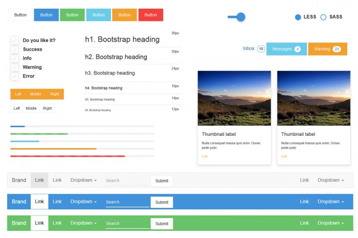
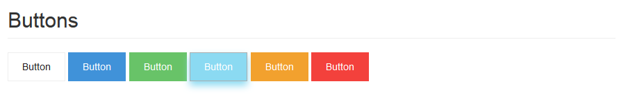
Bootstrap-material-design-bootstrap-elements-components
Download Package:
https://www.gittip.com/FezVrasta/
FezVrasta bootstrap-material-design master.zip
Material design for Bootstrap 3 by stas-melnikov
This theme is a skin for Bootstrap, which means that can be used with any site built with the Bootstrap framework 3. With easy installation and customization thanks to the LESS/SASS files included and the custom themes colors ready to use. This skin is based on a material design and also extends the styles directly applied to Bootstrap files. There’s no overwritten rules or bloating CSS, making a lightweight skin as Boostrap is itself.
Install
Bower
$ bower install material_bootstrap_theme
Getting started
Include following files in head section
Browsers
IE10+, Opera, Safari, Yandex browser, Chrome, Firefox, Mobile Safari, Android
Download :
Material design for bootstrap. http://stas-melnikov.ru/material_bootstrap_theme/
Below we take a closer look at how you can use it.
Typography
In the theme we used 2 main fonts: Roboto light and Roboto regular. To display titles we selected the following variations that are presented in the figure below

Drop-down lists
All variations of the lists are customized and implemented in the theme. Pay attention to new classes : material_dropdown_btn, material_dropdown_menu and material_dropdown_menu_link. To use the list in your projects, you need to create the layout like below.

Form elements
As is known, the most important UI elements are form elements: text inputs, textarea, radioboxes, checkboxes, switch buttons etc. The Bootstrap provides a lot of options to represent them: single buttons, group of button, buttons with drop-down lists, various states of the buttons and so on.
Below you can see how the form elements look like in the theme.

Navigation elements
There are several ways to create navigation in Bootstrap 3: Navbar, pils, pagination, breadcrumbs. Below you can find the breadcrumb and the navbar:


CSS Media Queries For Common Devices
/* All Smartphones in portrait and landscape ----------- */
@media only screen
and (min-device-width : 320px)
and (max-device-width : 480px) {
/* YOUR STYLE GOES HERE */
}

/* All Smartphones in landscape ----------- */
@media only screen
and (min-width : 321px) {
/* YOUR STYLE GOES HERE */
}

/* All Smartphones in portrait ----------- */
@media only screen
and (max-width : 479px) {
/* YOUR STYLE GOES HERE */
}

/***** ANDROID DEVICES *****/

/* Android 240 X 320 ----------- */
@media only screen
and (max-width: 241px){
/* YOUR STYLE GOES HERE */
}

/* Android(Samsung Galaxy) in portrait 380 X 685 ----------- */
@media only screen
and (min-width: 375px)
and (max-width: 385px){
/* YOUR STYLE GOES HERE */
}

/* Android(Samsung Galaxy) in Landscape 685 X  380 ----------- */
@media only screen
and (min-width: 680px)
and (max-width: 690px){
/* YOUR STYLE GOES HERE */
}

/* Kindle Portrait 600 X 1024 ----------- */
@media only screen
and (min-width: 595px)
and (max-width: 610px){
/* YOUR STYLE GOES HERE */
}

/* Kindle Landscape 1024 X 600 ----------- */
@media only screen
and (min-width: 1000px)
and (max-width: 1030px){
/* YOUR STYLE GOES HERE */
}

/***** ALL GENERATION IPADS *****/

/* iPads in portrait and landscape----------- */
@media only screen
and (min-device-width : 768px)
and (max-device-width : 1024px) {
/* YOUR STYLE GOES HERE */
}

/* iPad in landscape----------- */
@media only screen
and (min-device-width : 768px)
and (max-device-width : 1024px)
and (orientation : landscape) {
/* YOUR STYLE GOES HERE */
}

/* iPad in portrait----------- */
@media only screen
and (min-device-width : 768px)
and (max-device-width : 1024px)
and (orientation : portrait){
/* YOUR STYLE GOES HERE */
}


/***** Retina IPAD 3 & 4*****/

/* Retina iPad 3 & 4 in portrait and landscape----------- */
@media only screen
and (min-device-width : 768px)
and (max-device-width : 1024px)
and (-webkit-min-device-pixel-ratio: 2){
/* YOUR STYLE GOES HERE */
}

/* Retina iPad 3 & 4 in landscape----------- */

@media only screen
and (min-device-width : 768px)
and (max-device-width : 1024px)
and (orientation : landscape)
and (-webkit-min-device-pixel-ratio: 2){
/* YOUR STYLE GOES HERE */
}

/* Retina iPad 3 & 4 in landscape----------- */

@media only screen
and (min-device-width : 768px)
and (max-device-width : 1024px)
and (orientation : portrait)
and (-webkit-min-device-pixel-ratio: 2){
/* YOUR STYLE GOES HERE */
}


/***** IPAD 1 & 2 (ALSO IPAD MINI)*****/

/* iPad 1 & 2 in portrait and landscape ----------- */
@media only screen
and (min-device-width : 768px)
and (max-device-width : 1024px)
and (-webkit-min-device-pixel-ratio: 1){
/* YOUR STYLE GOES HERE */
}

/* iPad 1 & 2 in landscape ----------- */
@media only screen
and (min-device-width : 768px)
and (max-device-width : 1024px)
and (orientation : landscape)
and (-webkit-min-device-pixel-ratio: 1)  {
/* YOUR STYLE GOES HERE */
}

/* iPad 1 & 2 in portrait ----------- */
@media only screen
and (min-device-width : 768px)
and (max-device-width : 1024px)
and (orientation : portrait)
and (-webkit-min-device-pixel-ratio: 1){
/* YOUR STYLE GOES HERE */
}

/* Desktops and laptops ----------- */
@media only screen
and (min-width : 1224px) {
/* YOUR STYLE GOES HERE */
}

/* Large screens ----------- */
@media only screen
and (min-width : 1824px) {
/* YOUR STYLE GOES HERE */
}

/* Only iPhone 4 ----------- */
@media
only screen and (-webkit-min-device-pixel-ratio : 1.5),
only screen and (min-device-pixel-ratio : 1.5) {
/* YOUR STYLE GOES HERE */
}
Essential css hacks for IE/Win - Quirks
Note: "All" == IE5+/Win, Op6+, Moz, Saf
IE7 only
* + html .element { margin-bottom: 10px; }
/*\*/ * html selector { property: value; } /**/
selector { property: value; p\roperty: normal-value; }
*:first-child+html selector { property: value; }
html>body selector { property: value; }
* html selector { property /**/: value; }
selector { property /**/: value; }
selector { property/**/: value; }
selector { property: /**/value; }
Css Reset styles
background:#0C0C0C none repeat scroll 0 0;
color:#fff;
font-family:verdana;
font-size:12px;
margin:0 auto;
padding:0;
width:952px;
}
html>body{
font-size:8.5pt;
}
h1,h2,h3,h4,h5,h6,div,table,ul,ul li,p,form,a,img{
margin:0;
padding:0;
outline:none;
}
img{
border:0;
}
li{
margin:0;
padding:0;
text-decoration:none;
list-style:none;
}
a{
text-decoration:none;
}
a:hover{
outline:none;
}
input{
outline:none;
}
#top{
position:absolute;
left:-999em;
width:990em;
}
.clsClearFix{
overflow:hidden;
zoom:1;
}
* html .clsClearFix{
height:1%;
overflow:visible;
}
table{
color:#000;
margin:0;
padding:0;
width:99%;
}
td{
vertical-align:top;
color:#000;
border-collapse:collapse;
}
/*-- End Of Common Styles --*/
/* 8 roundered corners */
* html .tlc-Escortnews,* html .trc-Escortnews{
height:1%}
* html .lb-Escortnews{
width:100%
}
.lb,.tlc-Escortnews,.trc-Escortnews{
zoom:1
}
.tlc-Escortnews{
background:transparent url(../images/tlc-rose.jpg) no-repeat;
}
.trc-Escortnews{
background:transparent url(../images/trc-rose.jpg) no-repeat right top;
}
.blc-Escortnews{
background:transparent url(../images/blc-rose.jpg) no-repeat left bottom;
}
.brc-Escortnews{
background:transparent url(../images/brc-rose.jpg) no-repeat right bottom;
}
.tb-Escortnews{
background:transparent url(../images/tb-rose.jpg) repeat-x;
}
.bb-Escortnews{
background:transparent url(../images/bb-rose.jpg) repeat-x center bottom;
}
.rb-Escortnews{
background:transparent url(../images/rb-rose.jpg) repeat-y right top;
}
.lb-Escortnews{
background:#fff url(../images/lb-rose.jpg) repeat-y left bottom;
}
/* TCB Coodes */
.top_hotlist_dark {
background:transparent url(../images/top_hotlist_dark.png) no-repeat scroll left top;
padding-top:33px;
}
.bottom_hotlist_dark {
background:transparent url(../images/bottom_hotlist_dark.png) no-repeat scroll left bottom;
padding-bottom:8px;
}
.center_hotlist_dark {
background:transparent url(../images/center_hotlist_dark.jpg) repeat-y scroll left top;
}
/* LCR */
.clsCommonProfileLink li a{ text-decoration:none;display:block;
float:left; }
.clsCommonProfileLink li a span span{
line-height:23px;
font-size:11px;
font-weight:bold;
color:#000;
text-decoration:none;
padding:0 6px;
}
.clsCommonProfileLink a:hover span ,.clsCommonProfileLink .clsActiveCommonProfileLink a span {
background:url(bg-videoactiveleft.jpg) no-repeat left top;
float:left;
height:36px;
display:block;
padding-left:6px;
}
.clsCommonProfileLink a:hover,.clsCommonProfileLink .clsActiveCommonProfileLink a{
background:url(bg-videoactivearrow.jpg) no-repeat center 26px;
color:#FFF;
text-decoration:none;
}
.clsCommonProfileLink a:hover span span,.clsCommonProfileLink .clsActiveCommonProfileLink a span span{
background:url(bg-videoactiveright.jpg) repeat-x right top;
color:#FFF;
display:block;
float:left;
height:27px;
padding:0 6px 0 0;
}
HTML5 Reset Stylesheet
margin:0;
padding:0;
border:0;
outline:0;
font-size:100%;
vertical-align:baseline;
background:transparent;
}
body {
line-height:1;
}
article,aside,details,figcaption,figure,
footer,header,hgroup,menu,nav,section {
display:block;
}
nav ul {
list-style:none;
}
blockquote, q {
quotes:none;
}
blockquote:before, blockquote:after,
q:before, q:after {
content:'';
content:none;
}
a {
margin:0;
padding:0;
font-size:100%;
vertical-align:baseline;
background:transparent;
}
/* change colours to suit your needs */
ins {
background-color:#ff9;
color:#000;
text-decoration:none;
}
/* change colours to suit your needs */
mark {
background-color:#ff9;
color:#000;
font-style:italic;
font-weight:bold;
}
del {
text-decoration: line-through;
}
abbr[title], dfn[title] {
border-bottom:1px dotted;
cursor:help;
}
table {
border-collapse:collapse;
border-spacing:0;
}
/* change border colour to suit your needs */
hr {
display:block;
height:1px;
border:0;
border-top:1px solid #cccccc;
margin:1em 0;
padding:0;
}
input, select {
vertical-align:middle;
}
How CSS Positioning Works?
The position property is one of the most useful tools that designers have in their CSS toolbox. However, there are a few concepts about positioning that might baffle beginners. First, what is positioning?
When your browser opens a webpage, it starts rendering elements (divs, paragraphs, headings etc.) in the order they appear in the HTML markup of the page. Positioning is a natural way of organizing how the elements are displayed and an easy resolution to situations like overlaps. There are four types of positioning: static, relative, absolute and fixed.
Elements are statically positioned by default
The default positioning, which is implicitly applied to every element on the page, is static. Static positioning means that every element is positioned in the natural order it is added to the page. Block elements are displayed under other block elements, and inline elements are displayed next to other inline elements.
Relative positioning
Setting the positioning to relative does not by itself produce any noticeable difference in the way the element is displayed on the page. But you can now move it from its normal position with the top, left, bottom and right CSS properties. This comes really handy when dealing with situations in which you need to offset an element, but not anchor it to a specified position on the page.
.relativeDiv{
/*
    Moving the div to the top-left
    from where it would normally show:
 */

position:relative;
top:-50px;
left:-100px;
}
Fixed positioning
Adding position:fixed to the CSS declarations of an element, positions it in relation to the browser window. This allows you to display toolbars, buttons or navigation menus, which are anchored at a fixed position and scroll with the page.
.fixedDiv{
/*
    Fixing the div 20 px from the bottom
    of the browser window:
 */

position:fixed;
right:20px;
bottom:20px;
}
Probably the only drawback is that this positioning is not supported in older browsers like IE6, if you can’t afford the luxury of dropping support for these.
Absolute positioning
An absolutely positioned element is displayed on the page in relation to the document, or a parent element with a positioning different from static. This way, using the top, left, bottom and right CSS properties, you can specify an exact position.
.parentDiv{
/* Absolute and Fixed positioning would work as well: */

position:relative;
}
.absoluteDiv{
/*
    Displaying the div 50px from the right and 90px from
    the top of its parent because of the explicit positioning
 */

position:absolute;
right:50px;
top:90px;
}
The benefits
Using these positioning properties you can achieve all kinds of advanced page layouts, which will bring your designs to the next level. In conjunction with the z-index property, you can change the default overlay rules that apply to elements (elements which appear later in the code are shown above the previous ones).
