Multiple Background Images
Applying multiple background images in CSS3 is quite easy, using a comma with the standard background property.
E.g. background: url(image_1.extention) top right no-repeat, url(image_2.extention) bottom right no-repeat;
- CSS3 Background Image (Multiple)
- #my_CSS3_id {
- background: url(image_1.extention) top left no-repeat,
url(image_2.extention) bottom left no-repeat,
url(image_3.extention) bottom right no-repeat; - }
CSS3 Transition
Use CSS 3 transition to give action to elements in your website, such as change in colour, motion and more!
CSS3 Transition
The basic syntax for creating a css transition is “property”, “duration”, and “type”.
If we take the following example (transition:color 1s ease-in;) – the property we are changing is the color, over a duration of 1 second and using the ease-in method). See below some examples of how this can be implemented into your projects.
CSS3 Colour Transition Example
Mouse over this example paragraph to see it fade to a new colour using a basic CSS3 transition.
- CSS3 Transition (color)
- .my_class {
- transition: color .5s ease-in;
- -moz-transition: color .5s ease-in;
- -o-transition: color .5s ease-in;
- -webkit-transition: color .5s ease-in;
- }
- .my_class:hover {
- color:#066;
- }
This is a good technique for creating mouseover actions for links and buttons.
Mouse over this example paragraph to see it rotate 7degrees using a transform transition.
- CSS3 Transition (transform)
- .my_class {
- transition: transform .5s ease-in;
- -moz-transition: -moz-transform .5s ease-in;
- -o-transition: -o-transform .5s ease-in;
- -webkit-transition: -webkit-transform .5s ease-in;
- }
- .my_class:hover {
- transform: rotate(7deg);
- -moz-transform: rotate(7deg);
- -o-transform: rotate(7deg);
- -webkit-transform: rotate(7deg);
- }
This can be used to create a more interactive website, such as menu items or image gallery.
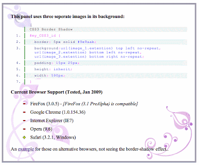
CSS3 Box Shadow
CSS Box Shadow
Used in casting shadows off block-level elements (like divs).
.shadow {
  -moz-box-shadow: 5px 5px 5px #ccc;
  -webkit-box-shadow: 5px 5px 5px #ccc;
  box-shadow: 5px 5px 5px #ccc;
}- The horizontal offset of the shadow, positive means the shadow will be on the right of the box, a negative offset will put the shadow on the left of the box.
- The vertical offset of the shadow, a negative one means the box-shadow will be above the box, a positive one means the shadow will be below the box.
- The blur radius, if set to 0 the shadow will be sharp, the higher the number, the more blurred it will be.
- Color
Inner Shadow
Example
Internet Explorer Box Shadow
You need extra elements...
<div class="shadow1">
        <div class="content">
                Box-shadowed element
        </div>
</div>.shadow1 {
margin: 40px;
background-color: rgb(68,68,68); /* Needed for IEs */
-moz-box-shadow: 5px 5px 5px rgba(68,68,68,0.6);
-webkit-box-shadow: 5px 5px 5px rgba(68,68,68,0.6);
box-shadow: 5px 5px 5px rgba(68,68,68,0.6);
filter: progid:DXImageTransform.Microsoft.Blur(PixelRadius=3,MakeShadow=true,ShadowOpacity=0.30);
-ms-filter: "progid:DXImageTransform.Microsoft.Blur(PixelRadius=3,MakeShadow=true,ShadowOpacity=0.30)";
zoom: 1;
}
.shadow1 .content {
position: relative; /* This protects the inner element from being blurred */
padding: 100px;
background-color: #DDD;
}Elastic Image Slideshow with Thumbnail Preview
The MarkupWe will create two unordered lists, one for the main slider and one for the thumbnail navigation beneath the large image. The "large slider" list elements will contain the image and a title with an h2 and h3 element:
01<div id="ei-slider" class="ei-slider">

02    <ul class="ei-slider-large">

03        <li>

04            <img src="images/large/1.jpg" alt="image01" />

05            <div class="ei-title">

06                <h2>Creative</h2>

07                <h3>Geek</h3>

08            </div>

09        </li>

10        <li>...</li>

11    </ul>

12    <ul class="ei-slider-thumbs">

13        <li class="ei-slider-element">Current</li>

14        <li>

15            <a href="#">Slide 1</a>

16            <img src="images/thumbs/1.jpg" alt="thumb01" />

17        </li>

18        <li>...</li>

19    </ul>

20</div>
The list for the thumbnail preview navigation will contain an absolute element (the first list element with the class ei-slider-element and the thumbnail list elements which consist of an anchor and an image (the thumbnail).
Now, let’s add the style.
The CSS
First, we will define the style for the main wrapper. We will have the slider inside of a wrapper which will be 100% in width in order to stretch over the whole window. Now, the slider itself will also have a width of 100%, making it use all the space there is in width. But we will also define a maximum width, so that the images in our slider don’t get stretched too much when dealing with a big screen:
1 .ei-slider{
2 position: relative;
3 width: 100%;
4 max-width: 1920px;
5 height: 400px;
6 margin: 0 auto;
7 }
While the images are loading, we will add a loading element which will have the following style:
01 .ei-slider-loading{
02 width: 100%;
03 height: 100%;
04 position: absolute;
05 top: 0px;
06 left: 0px;
07 z-index:999;
08 background: rgba(0,0,0,0.9);
09 color: #fff;
10 text-align: center;
11 line-height: 400px;
12 }
The unordered list will occupy all the space we defined and will not show any overflow:
1 .ei-slider-large{
2 height: 100%;
3 width: 100%;
4 position:relative;
5 overflow: hidden;
6 }
The list elements that will hold the images will be of absolute position. Depending from where we navigate we will slide them from the left or from the right:
1 .ei-slider-large li{
2 position: absolute;
3 top: 0px;
4 left: 0px;
5 overflow: hidden;
6 height: 100%;
7 width: 100%;
8 }
The width of the image will be set in our JavaScript but we also want to define it if we don’t have JS enabled:
1 .ei-slider-large li img{
2 width: 100%;
3 }
The title holder will be positioned in the middle of the list element with a right margin to fit the picture in our example (and not to overlap the face in the photography):
1 .ei-title{
2 position: absolute;
3 right: 50%;
4 margin-right: 13%;
5 top: 30%;
6 }
The style for the headings is the following:
01 .ei-title h2, .ei-title h3{
02 text-align: right;
03 }
04 .ei-title h2{
05 font-size: 40px;
06 line-height: 50px;
07 font-family: 'Playfair Display', serif;
08 font-style: italic;
09 color: #b5b5b5;
10 }
11 .ei-title h3{
12 font-size: 70px;
13 line-height: 70px;
14 font-family: 'Open Sans Condensed', sans-serif;
15 text-transform: uppercase;
16 color: #000;
17 }
The navigation list will have a small height of 13 pixels. We will set a default width for the thumbnails in the initialisation of our plugin. From that width we will set a max-width to the unordered list. This will make it elastic when we resize the window, but not occupy all the width there is.
1 .ei-slider-thumbs{
2 height: 13px;
3 margin: 0 auto;
4 position: relative;
5 }
The list elements of the navigation list will be of relative position:
1 .ei-slider-thumbs li{
2 position: relative;
3 float: left;
4 height: 100%;
5 }
The special slider element that indicates the current image will be positioned absolutely on top of the current thumbnail element:
1 .ei-slider-thumbs li.ei-slider-element{
2 top: 0px;
3 left: 0px;
4 position: absolute;
5 height: 100%;
6 z-index: 10;
7 text-indent: -9000px;
8 background: rgba(0,0,0,0.9);
9 }
The link elements will have a white box shadow to show a tiny separation and some darker shadow to appear under them. We’ll also add a transition to the element so that we can change the background-color smoothly on hover:
01 .ei-slider-thumbs li a{
02 display: block;
03 text-indent: -9000px;
04 background: #666;
05 width: 100%;
06 height: 100%;
07 cursor: pointer;
08 box-shadow:
09 0px 1px 1px 0px rgba(0,0,0,0.3),
10 0px 1px 0px 1px rgba(255,255,255,0.5);
11 transition: background 0.2s ease;
12 }
13 .ei-slider-thumbs li a:hover{
14 background-color: #f0f0f0;
15 }
The image will be positioned absolutely and we will add a transition and a box reflection to it. Adding a max-width to it will make sure that the thumb will adjust to the size of the list element when the window gets smaller than the width of the unordered list itself:
01 .ei-slider-thumbs li img{
02 position: absolute;
03 bottom: 50px;
04 opacity: 0;
05 z-index: 999;
06 max-width: 100%;
07 transition: all 0.4s ease;
08 -webkit-box-reflect:
09 below 0px -webkit-gradient(
10 linear,
11 left top,
12 left bottom,
13 from(transparent),
14 color-stop(50%, transparent),
15 to(rgba(255,255,255,0.3))
16 );
17 }
On hover, we will animate the opacity and the bottom value so that it appears to be sliding in from the top:
1 .ei-slider-thumbs li:hover img{
2 opacity: 1;
3 bottom: 13px;
4 }
Last but not least, we want to make sure that from a certain width on, the slider title will not cover the best parts of our image. So, we will make it appear at the bottom of the image with a semi-transparent white background:
01 @media screen and (max-width: 830px) {
02 .ei-title{
03 position: absolute;
04 right: 0px;
05 margin-right: 0px;
06 width: 100%;
07 text-align: center;
08 top: auto;
09 bottom: 10px;
10 background: rgba(255,255,255,0.9);
11 padding: 5px 0;
12 }
13 .ei-title h2, .ei-title h3{
14 text-align: center;
15 }
16 .ei-title h2{
17 font-size: 20px;
18 line-height: 24px;
19 }
20 .ei-title h3{
21 font-size: 30px;
22 line-height: 40px;
23 }
24 }
For the case that we don’t have JavaScript enabled we will add this piece of CSS to ensure that our slides are shown. We will hide the thumbnail navigation:
1 .ei-slider{
2 height: auto;
3 }
4 .ei-slider-thumbs{
5 display: none;
6 }
7 .ei-slider-large li{
8 position: relative;
9 }
And that’s all the style! Let’s take a look at the JavaScript.
The JavaScript
Since we are creating a plugin, let’s first look at the definition of the options:
01 $.Slideshow.defaults = {
02 // animation types:
03 // "sides" : new slides will slide in from left / right
04 // "center": new slides will appear in the center
05 animation : 'sides', // sides || center
06 // if true the slider will automatically
07 // slide, and it will only stop if the user
08 // clicks on a thumb
09 autoplay : false,
10 // interval for the slideshow
11 slideshow_interval : 3000,
12 // speed for the sliding animation
13 speed : 800,
14 // easing for the sliding animation
15 easing : '',
16 // percentage of speed for the titles animation.
17 // Speed will be speed * titlesFactor
18 titlesFactor : 0.60,
19 // titles animation speed
20 titlespeed : 800,
21 // titles animation easing
22 titleeasing : '',
23 // maximum width for the thumbs in pixels
24 thumbMaxWidth : 150
25 };
In the _init funtion we will start by setting the opacity of the title elements and the images to 0. We will also preload the images and once they are loaded we will set their size and position according to the slider width and height. Then we configure the thumbnails navigation by setting the width of the unordered list and the list items.
We will then show the first slide and if we set autoplay in our options to true, then we’ll start the slideshow. The we initialize the events which are the events for resizing the window and for clicking the thumbnails:
01 _init : function( options ) {
02
03 this.options = $.extend( true, {}, $.Slideshow.defaults, options );
04
05 // set the opacity of the title elements and the image items
06 this.$imgItems.css( 'opacity', 0 );
07 this.$imgItems.find('div.ei-title > *').css( 'opacity', 0 );
08
09 // index of current visible slider
10 this.current = 0;
11
12 var _self = this;
13
14 // preload images
15 // add loading status
16 this.$loading = $('
17
18
19 ').prependTo( _self.$el );
20
21 $.when( this._preloadImages() ).done( function() {
22
23 // hide loading status
24 _self.$loading.hide();
25
26 // calculate size and position for each image
27 _self._setImagesSize();
28
29 // configure thumbs container
30 _self._initThumbs();
31
32 // show first
33 _self.$imgItems.eq( _self.current ).css({
34 'opacity' : 1,
35 'z-index' : 10
36 }).show().find('div.ei-title > *').css( 'opacity', 1 );
37
38 // if autoplay is true
39 if( _self.options.autoplay ) {
40
41 _self._startSlideshow();
42
43 }
44
45 // initialize the events
46 _self._initEvents();
47
48 });
49
50 },
And here are the single functions we just talked about:
001 _preloadImages : function() {
002
003 // preloads all the large images
004
005 var _self = this,
006 loaded = 0;
007
008 return $.Deferred(
009
010 function(dfd) {
011
012 _self.$images.each( function( i ) {
013
014 $('
015
016 if( ++loaded === _self.itemsCount ) {
017
018 dfd.resolve();
019
020 }
021
022 }).attr( 'src', $(this).attr('src') );
023
024 });
025
026 }
027
028 ).promise();
029
030 },
031 _setImagesSize : function() {
032
033 // save ei-slider's width
034 this.elWidth = this.$el.width();
035
036 var _self = this;
037
038 this.$images.each( function( i ) {
039
040 var $img = $(this);
041 imgDim = _self._getImageDim( $img.attr('src') );
042
043 $img.css({
044 width : imgDim.width,
045 height : imgDim.height,
046 marginLeft : imgDim.left,
047 marginTop : imgDim.top
048 });
049
050 });
051
052 },
053 _getImageDim : function( src ) {
054
055 var $img = new Image();
056
057 $img.src = src;
058
059 var c_w = this.elWidth,
060 c_h = this.$el.height(),
061 r_w = c_h / c_w,
062
063 i_w = $img.width,
064 i_h = $img.height,
065 r_i = i_h / i_w,
066 new_w, new_h, new_left, new_top;
067
068 if( r_w > r_i ) {
069
070 new_h = c_h;
071 new_w = c_h / r_i;
072
073 }
074 else {
075
076 new_h = c_w * r_i;
077 new_w = c_w;
078
079 }
080
081 return {
082 width : new_w,
083 height : new_h,
084 left : ( c_w - new_w ) / 2,
085 top : ( c_h - new_h ) / 2
086 };
087
088 },
089 _initThumbs : function() {
090
091 // set the max-width of the slider elements to the one set in the plugin's options
092 // also, the width of each slider element will be 100% / total number of elements
093 this.$sliderElems.css({
094 'max-width' : this.options.thumbMaxWidth + 'px',
095 'width' : 100 / this.itemsCount + '%'
096 });
097
098 // set the max-width of the slider and show it
099 this.$sliderthumbs.css( 'max-width', this.options.thumbMaxWidth * this.itemsCount + 'px' ).show();
100
101 },
102 _startSlideshow : function() {
103
104 var _self = this;
105
106 this.slideshow = setTimeout( function() {
107
108 var pos;
109
110 ( _self.current === _self.itemsCount - 1 ) ? pos = 0 : pos = _self.current + 1;
111
112 _self._slideTo( pos );
113
114 if( _self.options.autoplay ) {
115
116 _self._startSlideshow();
117
118 }
119
120 }, this.options.slideshow_interval);
121
122 },
The _slideTo function will take care of the transition between the slides. Depending on what we’ve set in our options, we’ll either make the new slide appear from the side or simply make it fade in without sliding it. We’ll also take care of the title and its heading elements which we will slightly slide from the sides by setting their right margins. The thumbnail slider element will have to move to the new corresponding thumbnail position.
01 _slideTo : function( pos ) {
02
03 // return if clicking the same element or if currently animating
04 if( pos === this.current || this.isAnimating )
05 return false;
06
07 this.isAnimating = true;
08
09 var $currentSlide = this.$imgItems.eq( this.current ),
10 $nextSlide = this.$imgItems.eq( pos ),
11 _self = this,
12
13 preCSS = {zIndex : 10},
14 animCSS = {opacity : 1};
15
16 // new slide will slide in from left or right side
17 if( this.options.animation === 'sides' ) {
18
19 preCSS.left = ( pos > this.current ) ? -1 * this.elWidth : this.elWidth;
20 animCSS.left = 0;
21
22 }
23
24 // titles animation
25 $nextSlide.find('div.ei-title > h2')
26 .css( 'margin-right', 50 + 'px' )
27 .stop()
28 .delay( this.options.speed * this.options.titlesFactor )
29 .animate({ marginRight : 0 + 'px', opacity : 1 }, this.options.titlespeed, this.options.titleeasing )
30 .end()
31 .find('div.ei-title > h3')
32 .css( 'margin-right', -50 + 'px' )
33 .stop()
34 .delay( this.options.speed * this.options.titlesFactor )
35 .animate({ marginRight : 0 + 'px', opacity : 1 }, this.options.titlespeed, this.options.titleeasing )
36
37 $.when(
38
39 // fade out current titles
40 $currentSlide.css( 'z-index' , 1 ).find('div.ei-title > *').stop().fadeOut( this.options.speed / 2, function() {
41 // reset style
42 $(this).show().css( 'opacity', 0 );
43 }),
44
45 // animate next slide in
46 $nextSlide.css( preCSS ).stop().animate( animCSS, this.options.speed, this.options.easing ),
47
48 // "sliding div" moves to new position
49 this.$sliderElem.stop().animate({
50 left : this.$thumbs.eq( pos ).position().left
51 }, this.options.speed )
52
53 ).done( function() {
54
55 // reset values
56 $currentSlide.css( 'opacity' , 0 ).find('div.ei-title > *').css( 'opacity', 0 );
57 $nextSlide.css( 'z-index', 1 );
58 _self.current = pos;
59 _self.isAnimating = false;
60
61 });
62
63 },
The _initEvents function will recalculate the sizes of the images when we resize the window and reposition the thumbnail slider element. When clicking on a thumbnail we will show the regarding slide:
01 _initEvents : function() {
02
03 var _self = this;
04
05 // window resize
06 $(window).on( 'smartresize.eislideshow', function( event ) {
07
08 // resize the images
09 _self._setImagesSize();
10
11 // reset position of thumbs sliding div
12 _self.$sliderElem.css( 'left', _self.$thumbs.eq( _self.current ).position().left );
13
14 });
15
16 // click the thumbs
17 this.$thumbs.on( 'click.eislideshow', function( event ) {
18
19 if( _self.options.autoplay ) {
20
21 clearTimeout( _self.slideshow );
22 _self.options.autoplay = false;
23
24 }
25
26 var $thumb = $(this),
27 idx = $thumb.index() - 1; // exclude sliding div
28
29 _self._slideTo( idx );
30
31 return false;
32
33 });
34
35 }
And that’s it! I hope you enjoyed this tutorial and find it useful!
XML syntax of HTML 5
Structural Tags in HTML5
The HTML5 specification has added quite a few interesting and useful tags for structuring your markup. For a majority of everyday uses, these tags will replace many of our typicaldiventries from our code. So let’s dig in.Defining Structure
A section is a thematic grouping of content, typically preceded by header, possibly with a footer after. sections can be nested inside of each other, if needed, and can hold any amount of typical markup.
A footer typically contains information about its section such as who wrote it, links to related documents, copyright data, and the like.
Defines the navigation area, typically a list of links. The nav should be a sibling of the main section, header, and footer.
An independent entry in a blog, magazine, compendium, and so on.
An aside indicates content that is tangentially related to the content around it.Putting it Together
So let’s take a look at how we would put together a typical blog page with our new structural tags.
<!DOCTYPE html>
<html>
  <head>
    <title>Standard Blog</title>
  </head>
  <body>
    <header>
      <h1><a href="#">Standard Blog</a></h1>
    </header>
    <nav>
      <ul>
        <li><a href="#">Home</a></li>
        <li><a href="#">Archives</a></li>
        <li><a href="#">About</a></li>
        <li><a href="#">Contact</a></li>
      </ul>
    </nav>
    <section>
      <article>
        <header>
          <h1><a href="#">Title</a></h1>
        </header>
        <section>
          <p>Lorem ipsum...</p>
        </section>
      </article>
      <article>
        <header>
          <h1><a href="#">Title</a></h1>
        </header>
        <section>
          <p>Lorem ipsum...</p>
        </section>
      </article>
      <article>
        <header>
          <h1><a href="#">Title</a></h1>
        </header>
        <section>
          <p>Lorem ipsum...</p>
        </section>
      </article>
    </section>
    <footer>
      <p>Copyright © 2008 All Rights</p>
    </footer>
  </body>
</html>
Note:This example is a little verbose in markup for the simplicity of the content, but I wanted to exaggerate for emphasis.As you can see, the tags themselves are much more descriptive than simply providing an id attribute to a div. This also gives the added benefit of a descriptive closing tag, as
is much more understandable that wondering which
So, I can use this now?
Actually, yes, with a few extra steps. And it will work in all modern browsers. It can even work in IE6. There are only a few little quirks we need to get past if we’re going to start using this today.
First, because most browsers don’t understand the new HTML5 doctype, they don’t know about these new tags in HTML5. Fortunately, due to the flexibility of browsers, they deal well with unknown tags. The only issue here is unknown tags have no default style, and are treated as inline tags. These new HTML5 tags are structural, and should obviously be block level elements. So, when we style them with CSS, we need to be sure to include display:block; in our attribute/value pairs.
Include this simple extra piece of CSS, and these new tags are immediately usable. Starting today. And of course, once HTML5 is more widely supported, the superfluous display:block; can be removed, as it will be included in the browser default styles.
Supporting IEThere is one more issue if you require IE support. Turns out that the IE rendering engine will work with the new tags, but will not recognize any CSS applied to them. Well, that’s no good. Fortunately, IE just needs a good swift kick with the help of a very simple bit of JavaScript. All we need to do to kick start IE is to create a DOM node with JavaScript for each of the new tags, and suddenly IE will apply styles to the new tags with no problem. The code will look something like this, and can be placed directly in the head of our document, or the contents of the script tag placed into an external file and included.Before we leave this code, there’s one thing to mention about the script tag in HTML5. HTML5 will assume type="text/javascript" on any script element, so it need not be included. Once again, making things simple.
Wrapping UpSo we can begin, right now, to structure our documents using the new tags provided in HTML5. With a few simple tricks, they’ll work today, and be compatible in the future. So next time you start a new site, consider going with HTML5, and give your markup a little more defined structure.
ColorZilla has a gradient editor for CSS3


Each of the presented gradients can be edited to provide customized optimale.L editor is simple to use, mainly to move the wrists (anchors) to a position relative to a color you autre.Lorsque Want to add one by clicking between two anchors.

The gradient thus created is displayed on a small banner that you still have the option to choose the orientation (vertical or horizontal), the dimensions of the banner overview, and emulating the rendering in IE.

Finally, this is the value of this tool, a CSS is dynamically generated to provide you with a usable result on up to navigateurs.Il is important to note that failure to support the values of gradient, a solid color background is defined which is the first color of your gradient.

Tab hover effect

#tabs {
list-style: none outside none;
margin:1px 0 0 10px;
height: 37px;
}
#tabs li {
background:url(../images/menubg.png) no-repeat scroll 0 -52px transparent;
display: block;
float: left;
height: 37px;
margin-right: 18px;
position: relative;
/* z-index: 1;*/
}
#tabs .current {
background: url(../images/menubg.png) no-repeat scroll 0 -2px transparent;
display: block;
float: left;
height: 37px;
position: relative;
}
#tabs .current {
z-index: 99;
}
#tabs li a {
background: url(../images/menubg.png) no-repeat scroll right -257px transparent;
color: #fff;
display: block;
font:bold 15px arial;
text-shadow:1px 2px 4px #000000;
height: 37px;
line-height: 37px;
margin-right: -39px;
padding: 0px 46px 0 29px;
text-align: center;
text-decoration: none;
}
#tabs .current a {
background: url("../images/menubg.png") no-repeat scroll right -206px transparent;
color: #fff;
display: block;
font:bold 15px arial;
text-shadow:1px 2px 4px #000000;
height: 37px;
line-height: 37px;
margin-right: -39px;
padding: 0px 46px 0 29px;
text-align: center;
text-decoration: none;
}
#tabs li:hover {
background: url("../images/menubg.png") no-repeat scroll 0 -2px transparent;
display: block;
float: left;
height: 37px;
position: relative;
}
#tabs li a:hover {
background: url("../images/menubg.png") no-repeat scroll right -206px transparent;
color: #fff;
display: block;
font:bold 15px arial;
text-shadow:1px 2px 4px #000000;
height: 37px;
line-height: 37px;
margin-right: -39px;
padding:0px 46px 0 29px;
text-align: center;
text-decoration: none;
}
Cross-Browser Canvas Demo
Demo showing the Canvas tag running in Firefox 3, Safari 3, and Internet Explorer 7. On IE the ExCanvas JavaScript shim is used.
3D Slides Built With HTML5, CSS3, and SVG
Nonlinear slide deck I built that can zoom into and out of topics depending on audience built with HTML5, CSS3, and SVG
Introduction to HTML 5
Are you interested in HTML 5 and what's coming down the pipeline but haven't had time to read any articles yet? I've put together an educational "Introduction to HTML 5" video that goes over many of the major aspects of this new standard, including:
* Web vector graphics with the Canvas tag and Scalable Vector Graphics (SVG)
* The Geolocation API
* HTML 5 Video
* The HTML 5 Database and Application Cache
* Web workers
The video is chock full of demos and sample source code.
(Note to moderators: HTML 5 is a public open web standard. I'm helping to educate web developers and raise awareness of this open web standard).
Best SEO Secret Tips
1 - Valid XHTML Code - Use Valid xhtml. Search engines prefer tidy houses. Use a markup validation service to ensure that your web pages comply with the latest W3C standards. Ideally, you should also consider using CSS style sheets to set up your web site design to cut down on the code vs. content ratio.2 - Meta Tags - Two parts of the meta tag deserve particular attention - the description meta tag and the title. The description meta tag is the information that users will see in the search engine results.
Continue reading...
Your main keyword should be the very first thing you put inside the title tag. Secondary keywords should follow. You should avoid using all capital letters.
3 - Keywords Throughout Page Content - After you have carefully selected your keywords and keyword phrases you should be using them throughout the text on your pages. It is important for your main keywords to have the correct keyword density to rank well in Search Engines. The recommended keyword density is from 3% - 7%, anything above 10% looks allot like keyword stuffing. You should check keyword density after each text change.
4 - Keywords in Image Alt Tags - It is important to include your keywords in these tags, however not just a spam type listing of all of all your keywords. Be as creative as possible here.
5 - Use Heading Tags and Bold Text - Instead of just making a-bit of text bold and bigger use the
and tags which get special attention from the search engines. Keyword specific bold text and bulleted list items are also favored by the search engines.
6 - Use Internal Anchor Text Links - Search engine spiders still love links. Linking throughout your site with descriptive text allows search engines spiders to find and ultimately index your site easily.
7 - Use an XML Site Map - Search engines love site maps! Create an xml site map to help search engines crawl your web site. Make sure you don't have any broken links.
8 - Write Content for Humans, Not Just Search Engines - You will find that you do better with search engines if your text reads naturally and is written for human eyes.
CSS: border-radius for FF ,Ghrome, IE9 , Opera , Safari
1. Definition and syntax for border-radius
As with many CSS properties relating to margins, padding and borders, there are four individual properties - one for each corner of a box element - and one shorthand property. Each of the corner attributes will accept either one or two values. The border-radius property will accept up to two values in WebKit browsers and up to eight now in Firefox 3.5.
| CSS3 (Opera browser) | Mozilla equivalent | WebKit equivalent |
|---|---|---|
| border-top-right-radius | -moz-border-radius-topright | -webkit-border-top-right-radius |
| border-bottom-right-radius | -moz-border-radius-bottomright | -webkit-border-bottom-right-radius |
| border-bottom-left-radius | -moz-border-radius-bottomleft | -webkit-border-bottom-left-radius |
| border-top-left-radius | -moz-border-radius-topleft | -webkit-border-top-left-radius |
| border-radius | -moz-border-radius | -webkit-border-radius |
At this time the CSS3 properties above do not work in Internet
Explorer. The 'Mozilla' versions however work perfectly well in
Firefox and other Mozilla-based browsers and the 'WebKit' ones in Safari
and Chrome.
Each of the individual corner CSS3 properties take either one or two
length values (generally 'px' or 'em' values). If a single value
is supplied then that becomes the radius of a rounded corner. If two
values are supplied then they become the horizontal and vertical radii
for an elliptical corner.
The Mozilla syntax before Firefox 3.5 only supported round (as
opposed to elliptical) corners and adding a second value would result in
a standard square corner.
The border-radius property in WebKit accepts one or two
values and uses them to style all four corners making a nice symmetric
shape. The new Firefox syntax allows you to
define four different round or elliptical corners. A slash has been
introduced to separate the horizontal and vertical length
settings.
2. Examples using -moz-border-radius
The following examples will only work if you're using Firefox or
another Mozilla browser that supports -moz-border-radius
properties.
-moz-border-radius: 1em;-moz-border-radius-topright: 2em;
-moz-border-radius-topleft: 2em;-moz-border-radius: 2em 0;-moz-border-radius: 3em 1em;The Mozilla properties used
here do not conform to the standard (hence the -moz-
prefix) and until Firefox 3.5 only supported round corners. In newer
versions of Firefox elliptical corners are also possible.
As some people have pointed out these properties can be used not just
for 'boxes' but for many other HTML objects including form elements.
For those of you still seeing square corners, here's a snapshot from
Firefox
showing the rounded corners effect:

There are a number of tricky JavaScript solutions that allow
border-radius and other CSS3 properties to be seen in Internet Explorer
and other browsers - but the overheads don't really justify the
results.
3. Support for -webkit-border-radius in Safari (Webkit)
The latest versions of Safari now support
-webkit-border-radius. Previously only the 'nightly builds'
contained this functionality In Opera the syntax for the corners is the
same as in Safari, but the behaviour of border-radius with two
values matches that of Firefox, as seen in Example #7 below:
-webkit-border-radius: 1em;-webkit-border-top-right-radius: 24px;
-webkit-border-top-left-radius: 24px;-webkit-border-radius: 24px 0;-webkit-border-radius: 36px 12px;-webkit-border-top-right-radius: 50px 30px;
-webkit-border-bottom-right-radius: 50px 30px;For those of you still
seeing square corners, below you can find asnapshot from WebKit showing
the rounded corners effect. Note particularly the change in syntax and
the effect of passing two values to -webkit-border-radius as
compared to the -moz-border-radius example above.

WebKit also has limited support for other CSS3 border properties such
as: multiple backgrounds; border background images; and various advanced
selectors (::select for example) making it a great test
platform for forward-looking developers. Stay tuned to the Surfin'
Safari blog linked below for the latest exciting developments.
4. Support in other browsers
Opera, and now Safari (Mac), will support border-radius
properties without any prefix. Internet Explorer, at least up to
version 8, has no support for the rounded corners css properties.
5. Other special effects
WebKit, Firefox and Opera now support a number of other CSS3
features, including the following simple effects and transforms.
Thankfully, unlike rounded corners, for the shadows and transforms there
does seem to be agreement on a common syntax.
-webkit-box-shadow
-webkit-border-radius: 36px 12px;

-moz-border-radius: 36px / 12px;

-webkit-box-shadow: 2px 2px 6px rgba(0,0,0,0.6);
Clearly there are still some
anti-aliasing problems, but for corners and gentle curves it can look
pretty cool.
Then there are various -webkit-tranform option that can be
used to create all kinds of wierd and wonderful shapes:
-webkit-transform: rotate()
-webkit-border-radius: 36px 12px;

-moz-border-radius: 36px / 12px;

-webkit-transform: rotate(-5deg);
-webkit-transform: skew()
-webkit-border-radius: 36px 12px;

-moz-border-radius: 36px / 12px;

-webkit-transform: skew(5deg,5deg);
For the browser-impaired
here is a screenshot from Safari showing the effect of these CSS rules.
The same effects are now possible in Firefox, Opera and related
browsers. Just replace -webkit with -moz or
-o, except for border-radius and box-shadow
where Opera uses no prefix.

Also in Safari these and other transformations can be implemented as
animations using just CSS effects
triggered by hovering over an element - no JavaScript required.
6. New short-hand properties
The following syntax is now working in Firefox and Opera allowing you
to specify not only matching elliptical corners, but also different
elliptical corners in one shorthand property.
Here we've recreated two of the WebKit examples above using the new
syntax. You can see that the individual corner settings work exactly
the same now in Firefox as in WebKit, but for the short-hand property
you need to include a slash:
-moz-border-radius: 36px / 12px;

border-radius: 36px / 12px;-moz-border-radius-topright: 50px 30px;
-moz-border-radius-bottomright: 50px 30px;And now to the scary part.
Using the short-hand property, all valued before the slash apply to the
horizontal radii and all values afterwards to the vertical. In this
example we've created a hybrid of the previous two examples.
-moz-border-radius: 36px 50px 50px 36px / 12px 30px 30px 12px

border-radius: 36px 50px 50px 36px / 12px 30px 30px 12px
Here you can see what these
boxes look like in Firefox 3.5:

Personally I'm not a big fan of these changes to the specification.
It seems to be a bit a backside-covering for the Mozilla group so they
can have all the new options without affecting anyone using their old
syntax. If/when this is adopted anyone using the WebKit syntax (Example
8), which conformed to the original Working Draft, will suddenly end up
with wonky boxes (Example 4).
7. Related Articles
- CSS: border-radius and -moz-border-radius
- CSS: Radial gradients syntax
- CSS: Linear gradients syntax
Different syntax for different rendering engines
Different syntax for different rendering engines
Mozilla (Firefox, Flock, etc)
Mozilla's syntax (more detail here) is like this:
-moz-linear-gradient([<point> || <angle>,]? <stop>, <stop> [, <stop>])
The simplest way to declare a gradient is to just list a comma separated list of colors. That will start at the top and gradient to the bottom with equidistant color stops for each color. In the demo code above, we use a point and an angle (90deg) to it go bottom-to-top instead. For radial gradients: -moz-radial-gradient
WebKit (Safari, Chrome, etc)
WebKit's syntax (more detail here) for Chrome 1-9 and Safari 4-5 is like this:
-webkit-gradient(<type>, <point> [, <radius>]?, <point> [, <radius>]? [, <stop>]*)
They have now dropped the old syntax and moved toward something simpler. As of Chrome 10 and Safari 5.1 it's now like this:
background-image: -webkit-linear-gradient([<point> || <angle>,]? <stop>, <stop> [, <stop>]); /* Chrome 10+, Saf5.1+ */
Opera
As of Opera 11.10, Opera supports CSS3 gradients in the same format as Mozilla and the latest WebKit.
background-image: -o-linear-gradient([<point> || <angle>,]? <stop>, <stop> [, <stop>]); /* Opera 11.10+ */
Trident (IE)
Trident's syntax (not really CSS3... more detail here) is like this:
filter: progid:DXImageTransform.Microsoft.gradient(GradientType=0, startColorstr=#1471da, endColorstr=#1C85FB);

-ms-filter: "progid:DXImageTransform.Microsoft.gradient (GradientType=0, startColorstr=#1471da, endColorstr=#1C85FB)";
"filter" should work in IE6-IE8 (haven't tested IE9), but it's not "valid" code. "-ms-filter" is valid, but only works in IE8+.
Unfortunately, we can't invite IE to the party! Using these filter properties does indeed work, and it would allow us to programmatically declare gradients which is cool. But, instead of using the filter first and the image as a fallback, declaring a background-image overrides the filter and it uses that. Since we definitely still need image fallbacks, we might as well not use this at all.
"Stops"
The WebKit and Mozilla syntax for gradients both incorporate "stops". A stop is an optional additional declaration that includes a point and a color. This means the gradient wont just start at one color and end at the other, it will fade to the stop color first, and that stop color will fade to the end color. More than one stop can also be used.

Saving HTTP requests
Using Firebug and looking in the Net tab to see all the resources used by the page, we can see the advantage.

The above screenshot is Firefox 3.6. We can see that the gradient fallback images are NOT loaded, which saves an HTTP request.
However using Firefox 3.5.8, the fallbacks are loaded.

We don't save any HTTP Requests in olders version of Firefox (This is 3.5.8 on Vista). The gradient fallback images are still being loaded (and used).
It gets a little more iffy in WebKit browsers.

WebKit browsers WILL use the CSS3 property to render the gradient, but at the same time, still load the fallback images, so no HTTP requests are saved. The only advantage is the programatic declaration of color.
UPDATE (August 9th, 2010)
As of this date, Safari 5.0.1 is still loading the fallback images, but Chrome 6.0.472.25 dev now joins the party of browsers that (awesomely) don't load the fallback image.
UPDATE (April 1st, 2011)
Safari is at 5.0.4 and is still loading fallback images. Opera 11.10 does the right thing out of the gate by not loading fallbacks.
Doing it by the numbers
The speed gained by losing an HTTP request, to me, is the biggest advantage. The more I learn about web performance it seems to me keeping those down is the #1 way to improve page load time. However there is another advantage to using CSS3 gradients, and that is that these gradients are created programmatically through numbers. Need to adjust some colors? Just adjust some numbers. No need to bring a big image editing program into the picture. This makes maintaining the site easier, as well as opens up doors for adjusting values on-the-fly. I imagine JavaScript libraries will begin to get the ability to animate these values soon enough, which will be pretty darn cool.
Ooooh Stretchy
When using an image for a gradient, it is declared as a CSS background-image and then repeated (you can often get away with a 1px slice, which is very efficient, size wise). The result though is that a static portion of the background is gradientized, and any overflow to that is flat color. Sometimes that works perfectly. Sometimes though it would be cool if the gradient stretched the entire height or width of the box. That is another thing CSS3 gradients can possibly be useful for:

So the big question is... is it really worth doing right now?
My answer on March 2nd, 2010: I'm thinking it's pretty darn close. If the numeric representation is a big deal to you, then I say yes you should start using them. If the speed is the only reason you would, then just realize that the only browser that it will help in is Firefox 3.6+, so you might wanna wait a bit on that.
My answer on April 1st, 2011: Pretty much yes, go for it, especially linear gradients. Linear gradients are more solid cross browser and browsers that don't support them are dropping in usage relatively quickly. Of course it depends on the exact use case, but typically a gradient is a visual nicety and thus a fallback of a solid color or image isn't such a big deal.
Additional Resources
- Latest syntax of WebKit gradients from the WebKit blog.
- Mozilla docs for linear gradients, repeating liner gradient, radial gradient, and repeating linear gradient.
- CSS3Please - latest syntax on gradients and many other CSS3 things.
- Lea Verou with clever and practical background techniques. Also see Lea's automatic gradients syntax converter thingy.
- Opera's introductory blog post on linear gradient support.
CSS 3 Gradient without image
The CSS 3 gradient syntax is the only one that is different for different browsers. the one used by FireFox seems to be the easiest..box_gradient
{
/* FireFox 3.6 */
background-image: -moz-linear-gradient(top, #444444, #999999);
/* Safari4+, Chrome */
background-image: -webkit-gradient(linear,left bottom,left top,color-stop(0, #444444),color-stop(1, #999999));
/* IE6,IE7 */
filter: progid:DXImageTransform.Microsoft.gradient(startColorstr='#444444', endColorstr='#999999');
/* IE8 */
-ms-filter: "progid:DXImageTransform.Microsoft.gradient(startColorstr='#444444', endColorstr='#999999')";
}
.gradient-bg {
/* fallback/image non-cover color */
background-color: #1a82f7;
/* fallback image */
background-image: url(images/fallback-gradient.png);
/* Firefox 3.6+ */
background-image: -moz-linear-gradient(#2F2727, #1a82f7);
/* Safari 4+, Chrome 1+ */
background-image: -webkit-gradient(linear, 0% 0%, 0% 100%, from(#1a82f7), to(#2F2727));
/* Safari 5.1+, Chrome 10+ */
background-image: -webkit-linear-gradient(#2F2727, #1a82f7);
/* Opera 11.10+ */
background-image: -o-linear-gradient(#2F2727, #1a82f7);
}
Null object Error Help Please ..........
package {import flash.events.MouseEvent;
import flash.events.Event;
import flash.utils.Timer;
import flash.events.TimerEvent;
import flash.utils.setTimeout;
import flash.net.URLRequest;
import flash.display.MovieClip;
import flash.display.Loader;
import fl.transitions.*;
import fl.transitions.easing.*;
public class gallery {
private var ref:Object;
private var lastObj:Object;
private var firstObj:Object;
private var numberOfImages:Number=9;
private var arr:Array=[];
private var Width:Number;
private var Height:Number;
private var imageCount:Number=1;
private var lastValue:Number;
private var timer:Timer;
private var firstObject:Object;
private var lastObject:Object;
public function gallery(obj:Object) {
ref=obj;
ref.image_mc.oldX=ref.image_mc.x;
ref.nxt_mc.addEventListener(MouseEvent.CLICK,moveNext);
ref.prev_mc.addEventListener(MouseEvent.CLICK,movePrev);
loadAllImage();
for (var i=1; i<=numberOfImages; i++) { attachClip(i,lastObj); arr.push(i); } firstObject=ref.image_mc.getChildAt(0); lastObject=ref.image_mc.getChildAt(ref.image_mc.numChildren-1); } private function movePrev(evnt:MouseEvent) { var currentX=ref.image_mc.oldX+(Width+Number(10)); var myTweenX = new Tween(ref.image_mc, "x", Strong.easeOut,ref.image_mc.x,currentX,0.5, true); var myTweenY = new Tween(ref.image_mc, "y", Strong.easeOut,ref.image_mc.y,ref.image_mc.y,0.5, true); ref.image_mc.oldX=currentX var id=setTimeout(removeLast,200) } private function moveNext(evnt:MouseEvent) { var currentX=ref.image_mc.oldX-(Width+Number(10)); var myTweenX = new Tween(ref.image_mc, "x", Strong.easeOut,ref.image_mc.x,currentX,0.5, true); var myTweenY = new Tween(ref.image_mc, "y", Strong.easeOut,ref.image_mc.y,ref.image_mc.y,0.5, true); ref.image_mc.oldX=currentX var id=setTimeout(removeFirst,200) } private function removeFirst() { try { if (lastObject==null) { lastObject=ref.image_mc.getChildByName('thumNail_'+numberOfImages); } var firstId:Number=firstObject.name.split('_')[1]; var lastId:Number=lastObject.name.split('_')[1]; firstObject.x=(lastObject.x+lastObject.width)+Number(10); if ((firstId+1)>numberOfImages) {
firstId=0;
}
firstObject=ref.image_mc.getChildByName('thumNail_'+(firstId+1));
lastObject=ref.image_mc.getChildByName('thumNail_'+firstId);
} catch (Err:*) {
}
}
private function removeLast() {
try {
if (firstObject==null) {
firstObject=ref.image_mc.getChildByName('thumNail_'+1);
}
if (lastObject==null) {
lastObject=ref.image_mc.getChildByName('thumNail_'+numberOfImages);
}
var firstId:Number=firstObject.name.split('_')[1];
var lastId:Number=lastObject.name.split('_')[1];
lastObject.x=(firstObject.x-firstObject.width)-Number(10);
if ((lastId-1)<0) {
lastId=numberOfImages
}
lastObject=ref.image_mc.getChildByName('thumNail_'+(lastId-1));
firstObject=ref.image_mc.getChildByName('thumNail_'+lastId);
} catch (Err:*) {
}
}
private function loadAllImage() {
try {
var url:String='images/image_'+imageCount+'.jpg';
imageCount++;
var req:URLRequest=new URLRequest(url);
var loader:Loader=new Loader();
loader.load(req);
loader.contentLoaderInfo.addEventListener(Event.COMPLETE,loadingCompleted);
} catch (Err:*) {
}
}
private function loadingCompleted(evnt:Event) {
loadAllImage();
}
private function attachClip(arg:Number,Obj:Object,num:Number=0) {
var thumNail:thumnail_mc=new thumnail_mc();
thumNail.name='thumNail_'+arg;
Width=thumNail.width;
Height=thumNail.height;
if (Obj) {
if (num!=0) {
thumNail.x=(Obj.x-Obj.width)-Number(10);
firstObj=thumNail;
} else {
thumNail.x=(Obj.x+Obj.width)+Number(10);
}
} else {
}
lastObj=thumNail;
thumNail._txt.text=String(arg);
ref.image_mc.addChild(thumNail);
loadThumNailImages(thumNail,arg);
}
private function loadThumNailImages(thumNail:Object,arg:Number) {
var url:String='images/image_'+arg+'.jpg';
var req:URLRequest=new URLRequest(url);
var loader:Loader=new Loader();
loader.load(req);
loader.contentLoaderInfo.addEventListener(Event.COMPLETE,imageLoadCompleted);
thumNail.image.addChild(loader);
}
private function imageLoadCompleted(evnt:Event) {
var target=(evnt.target.content);
target.parent.parent.width=Width;
target.parent.parent.height=Height/2;
}
}
}

No comments :
Post a Comment